Frame Magazine assigned photographer Thomas Brown and set designer Andrew Stellitano to create visual interpretations of four themes for their four latest issues – they always work in series for their covers, which they treat as an art project in themselves.
This way of working was an ideal fit for Thomas and Andrew, who enjoy the process of creating a thematically coherent series with colour and abstraction as the central concepts. The only stipulation that Frame made was that the images should be colourful, and there should be an environmental, spatial feel to the images, with architectural depth.
Having worked often together before, they took the initial proposal as a framework but built on it as the work progressed.
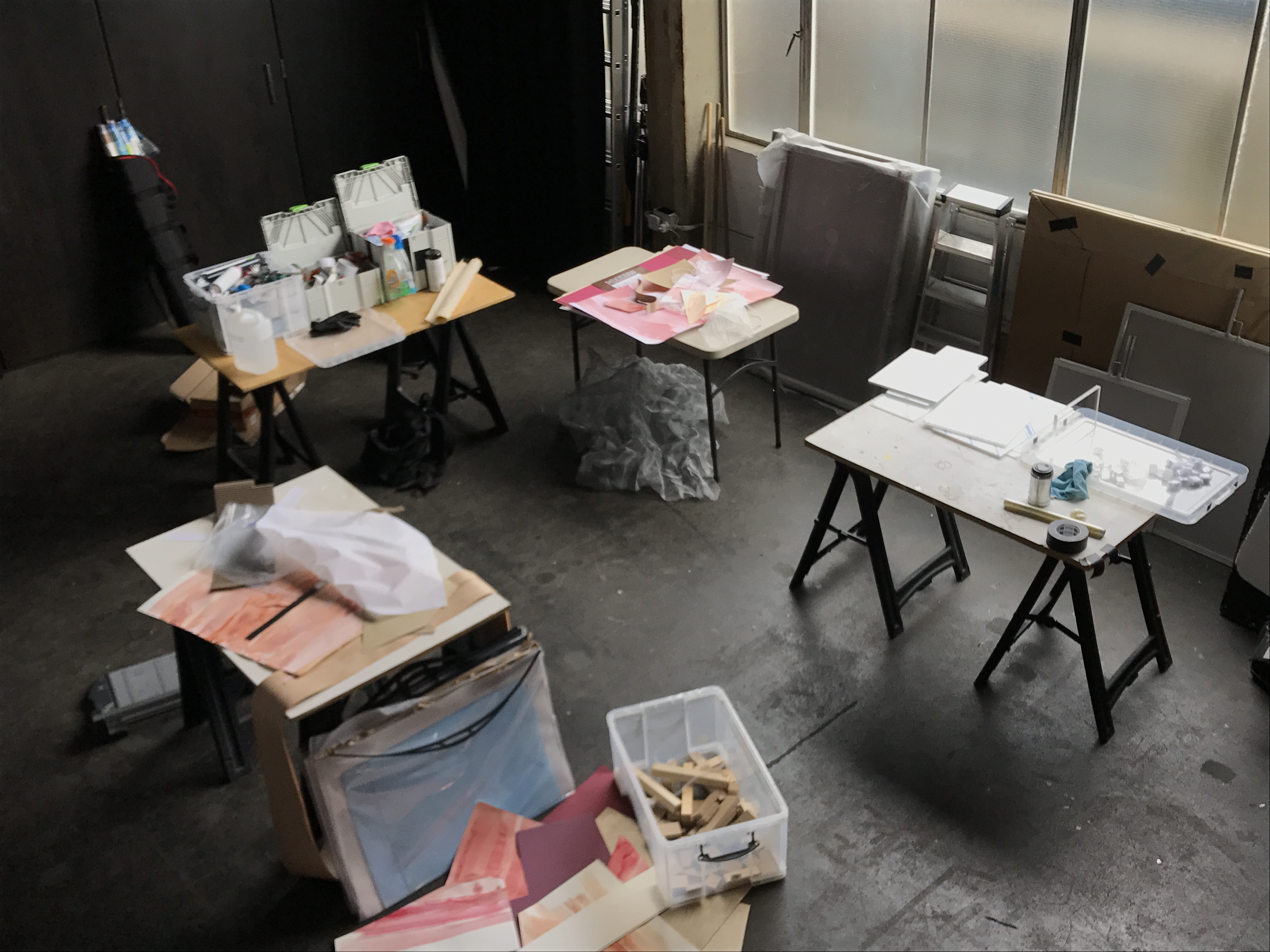
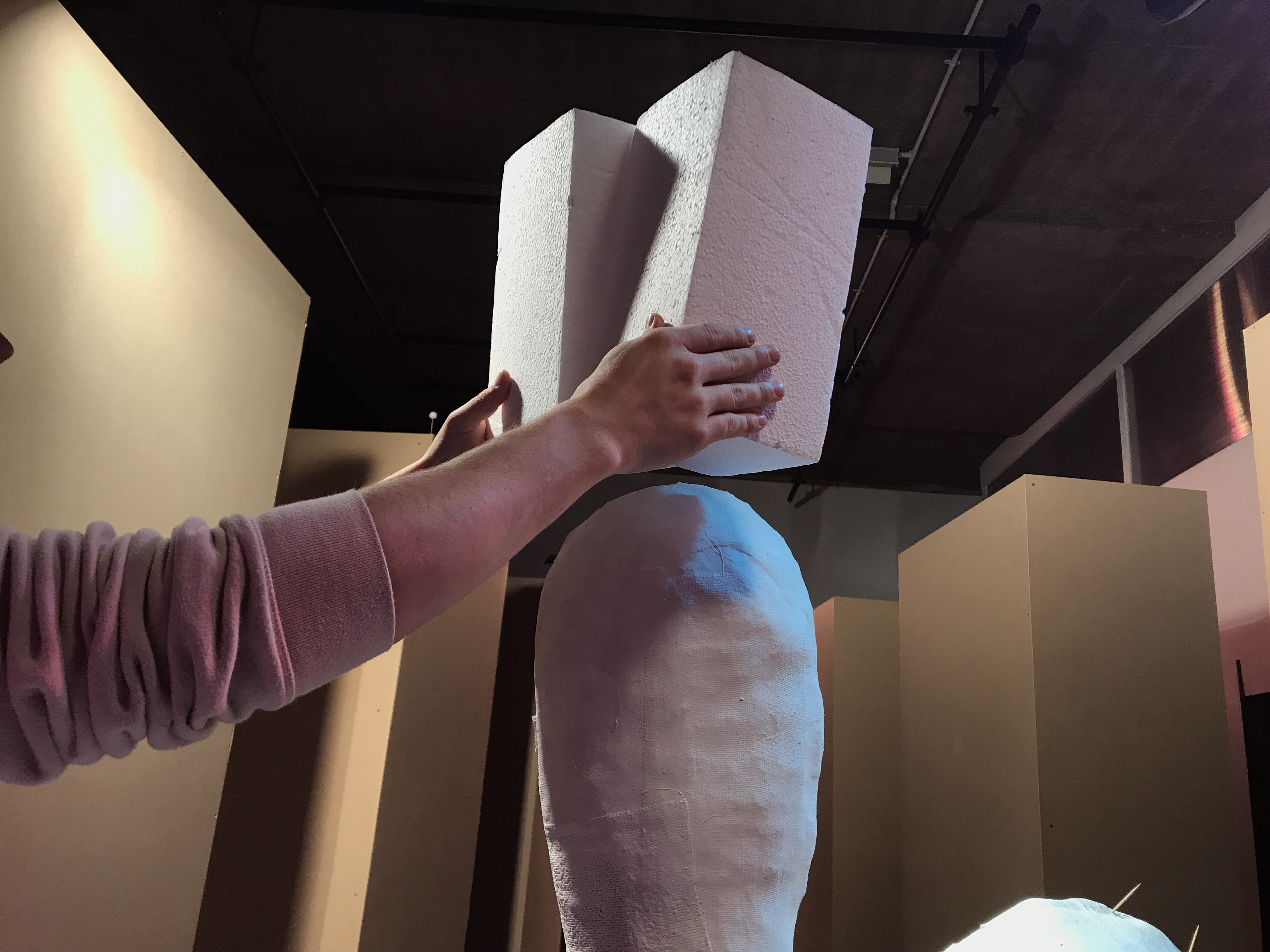
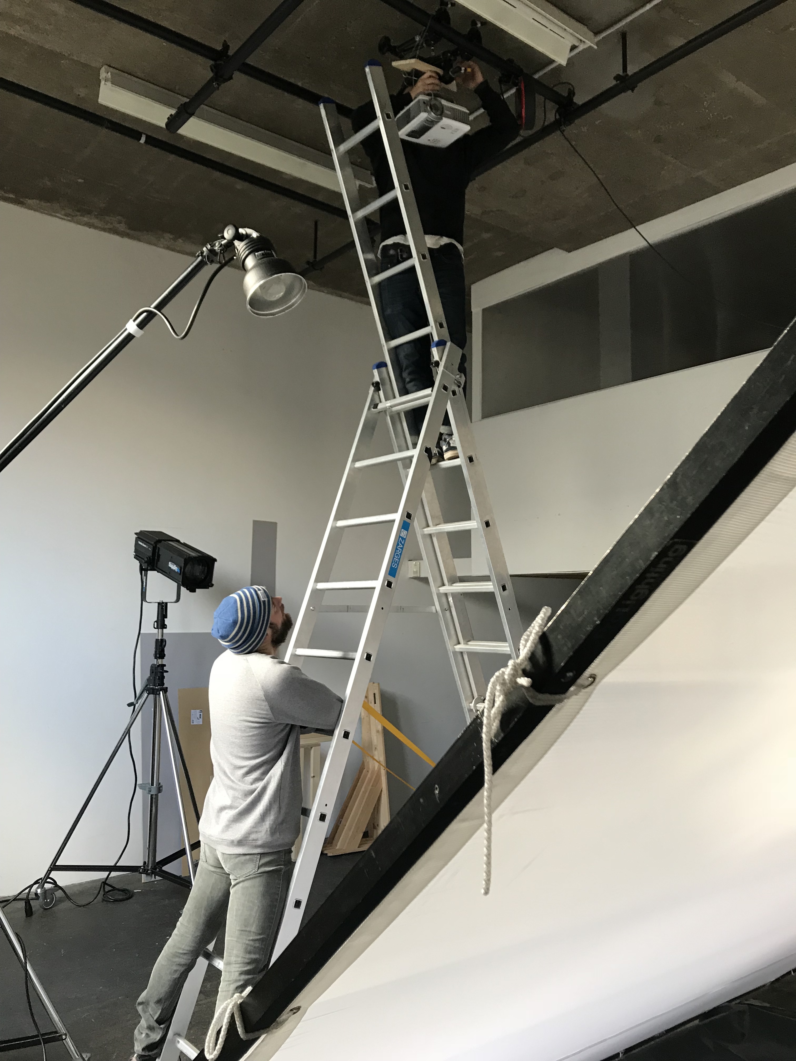
One of the most enjoyable parts of this project was the discovery of new ideas to try, as they arose from the initial concepts. It wasn’t all chin-stroking….there was a lot of laughter along the way, as these behind the scenes photos show – enjoy!
Nº 1 of 4: Doubt.
This was inspired by the idea of image as deceptions – thinking about the current geopolitical situation, fake news, the difficulty of knowing what is actually real.
“For the cover of this issue, we created a spatial experience that is all in the mind. The world seems to have flipped on its head, and nothing is as it seems. A tunnel that extends off into the distance is, on close examination, made out of a modular toolkit of materials” — Thomas Brown and Andrew Stellitano
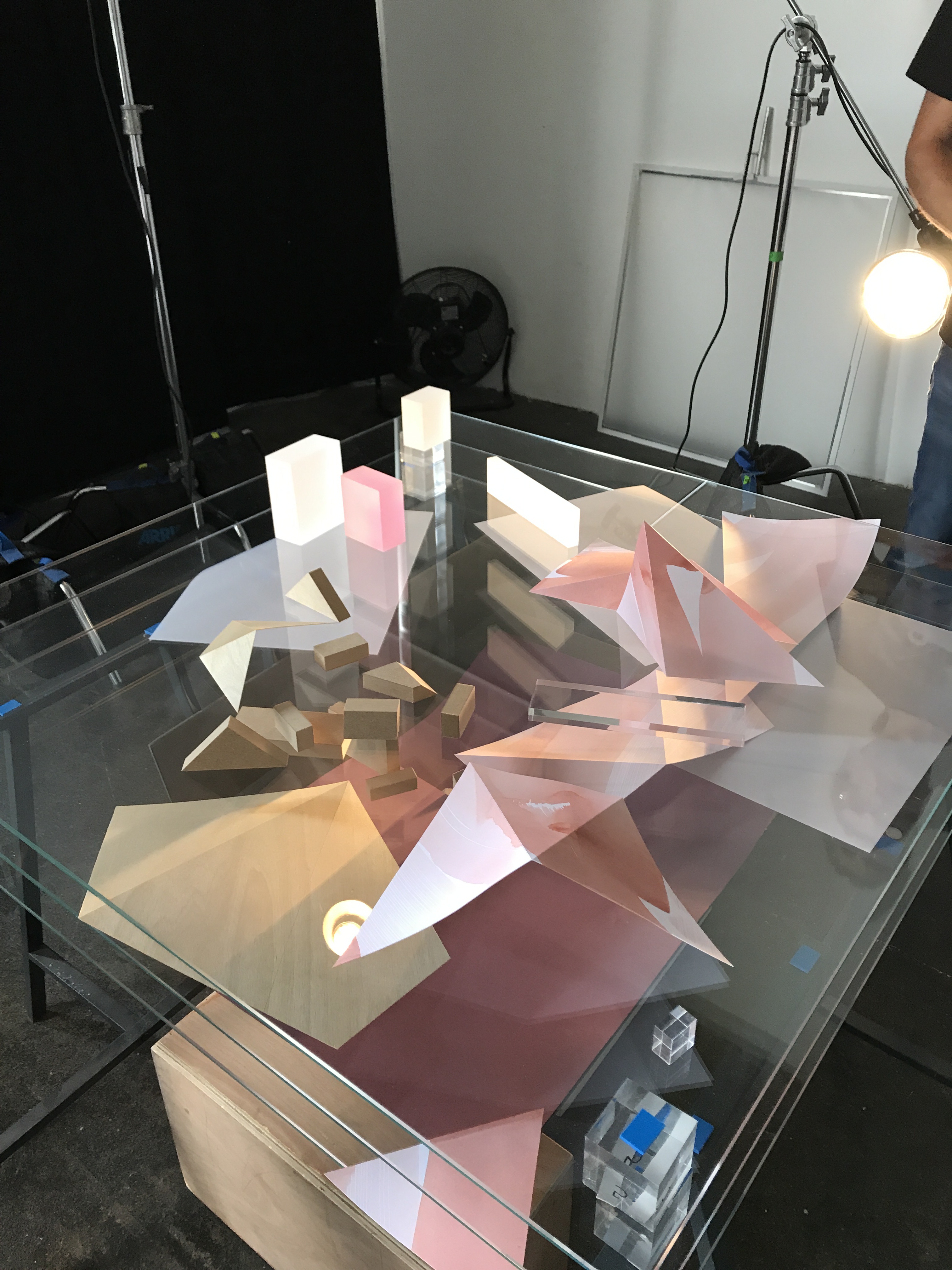


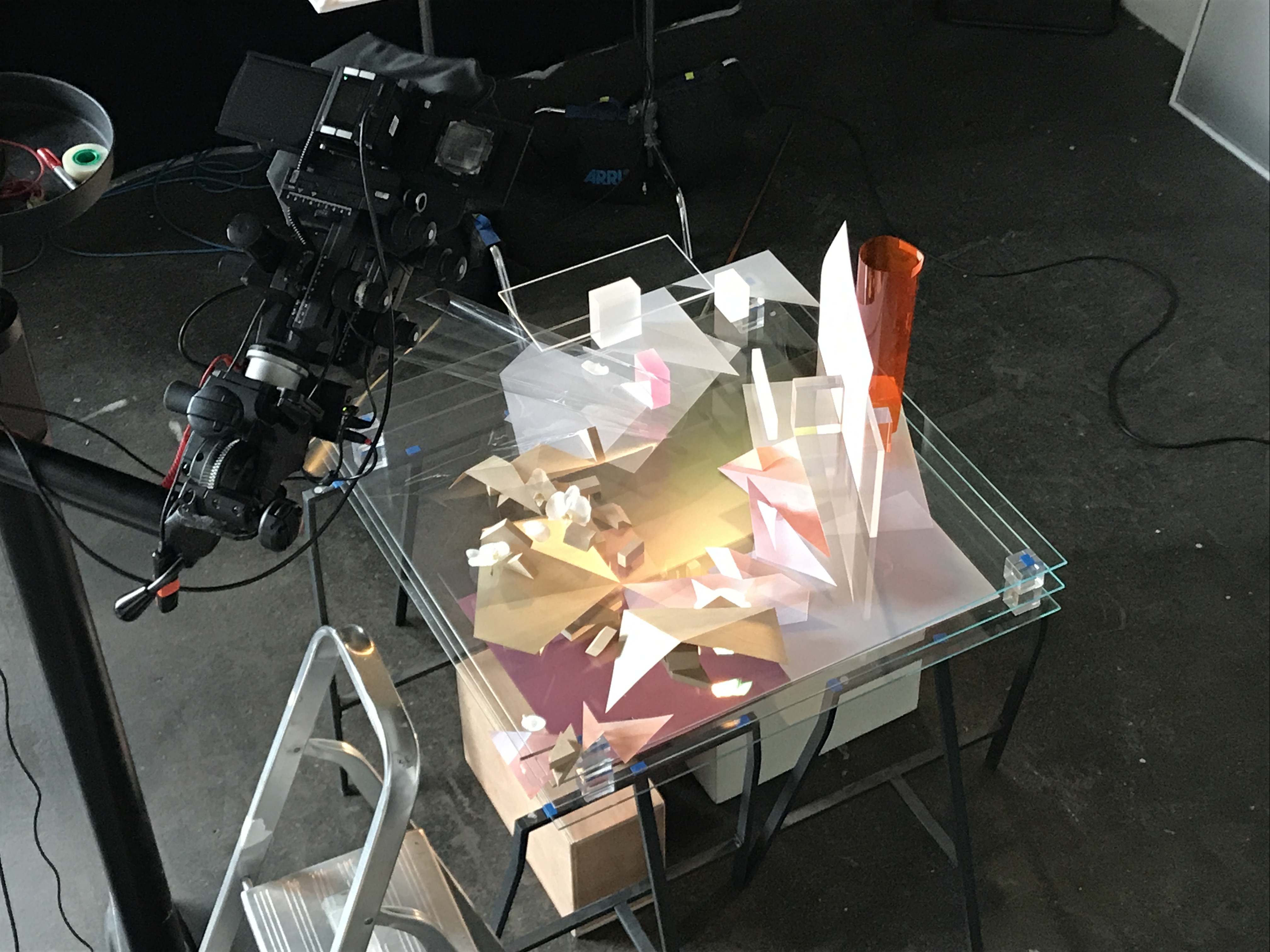
‘Using wood, paper, watercolour, acrylic, glass, organic materials and glycerine, …[they] built a multilayered world that hovers between fantasy and reality. Aptly titled Doubt, it’s their first cover in a series of four’

Nº 2 of 4: Ephemeral.
Exploring the idea of temporality and events such as fashion shows that are hugely involved but fleeting. Flashes in eight different colours captured blocks falling around the static forms.
“Inspired by the speed at which the world is changing, we wanted to create a sculpture that is more than the sum of its parts and that can be captured only as a photograph. With our camera, we compress time.” — Thomas Brown and Andrew Stellitano


“Using stroboscopic lighting in combination with long time exposures the photographer captured moving elements around a static object, creating a feeling of impermanence.” — Frame Magazine

Nº 3 of 4: Environment.
Here, the duo considered the enviroment in conjunction with illusion and image-making. It’s full of opposites – bringing the outside inside, gravity defying rocks, objectifying the natural and slicing the outside into contained bars in the background.
“We were inspired by a Diane Arbus photograph taken behind the scenes at Disneyland. The image shows huge boulders on wheels against the vast Californian landscape – an artificial backdrop at second sight. It’s a spellbinding scene that puts our expectation of reality into flux. ” — Thomas Brown and Andrew Stellitano
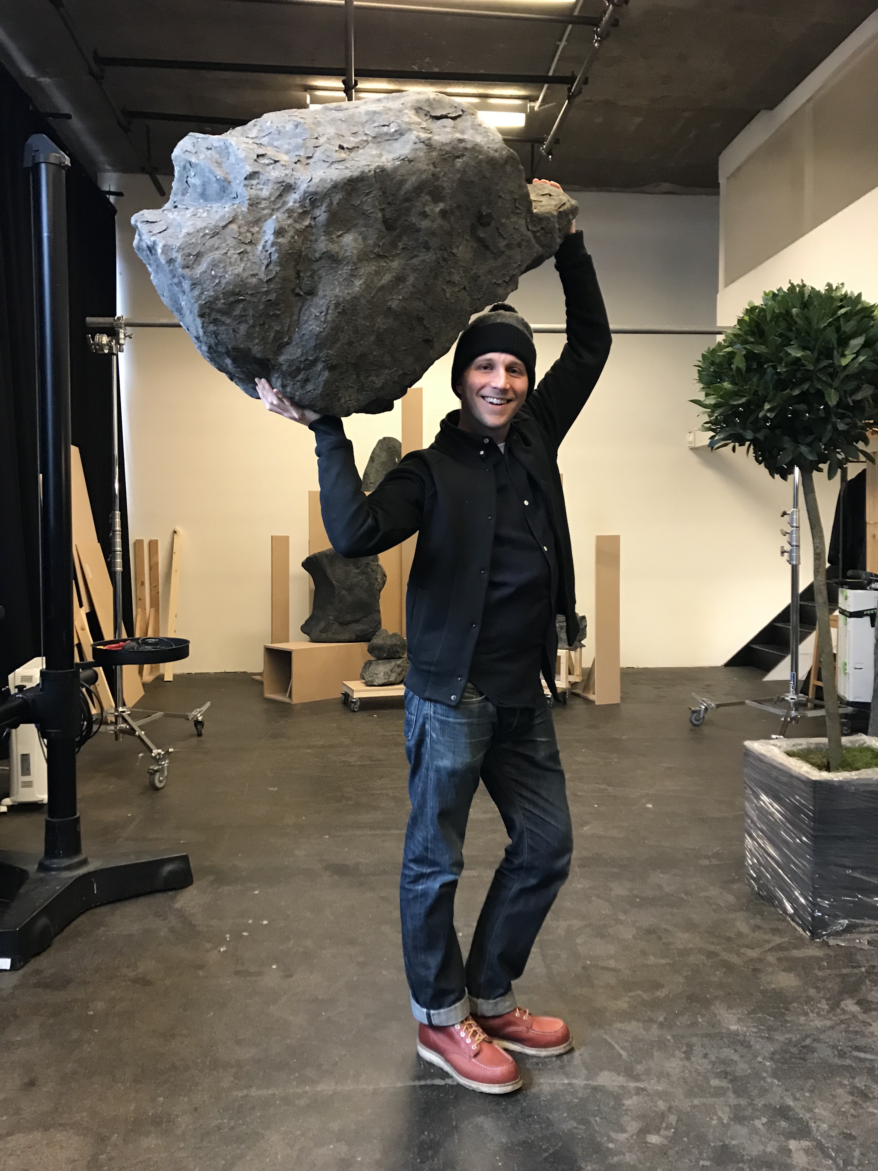

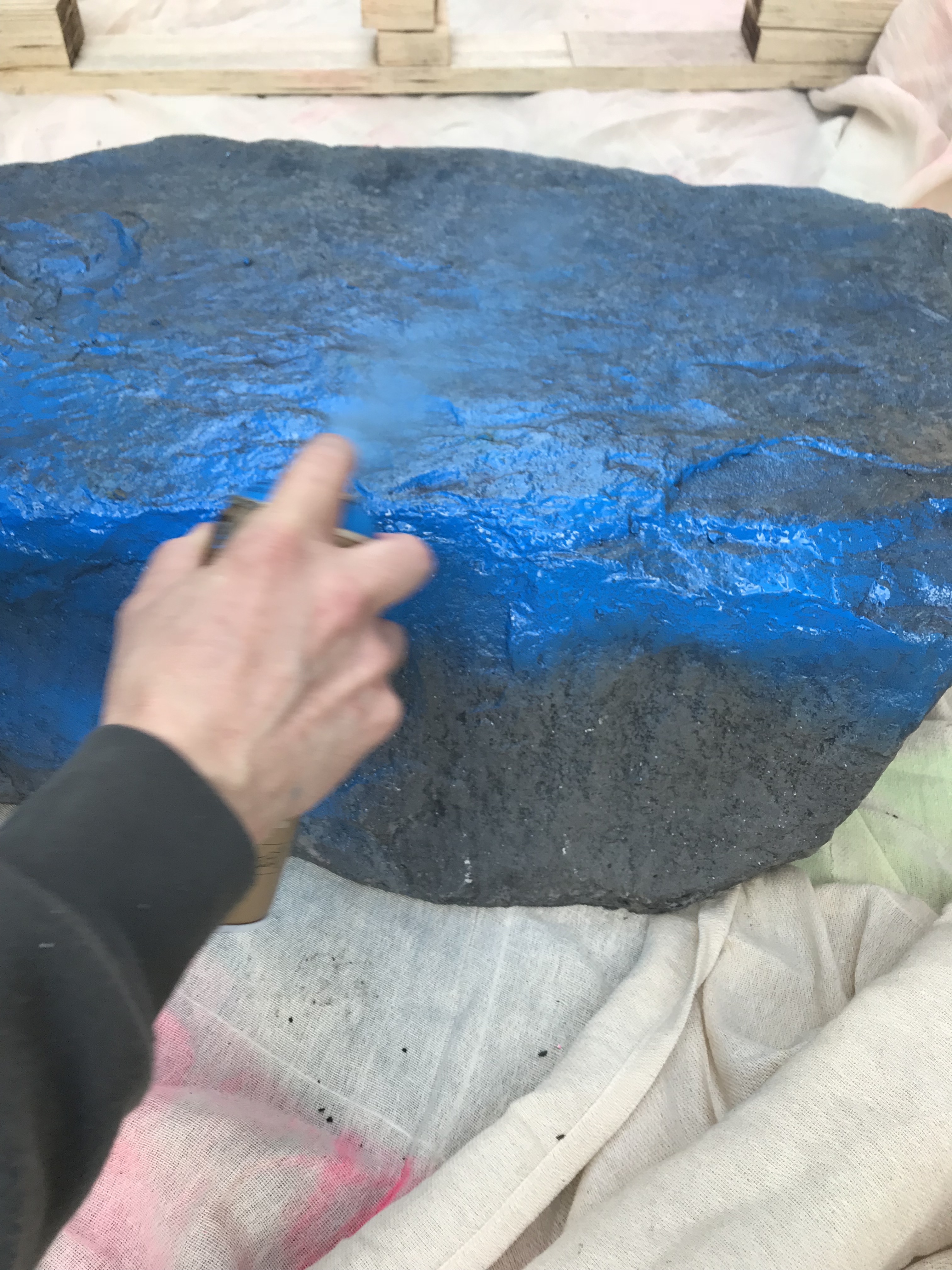
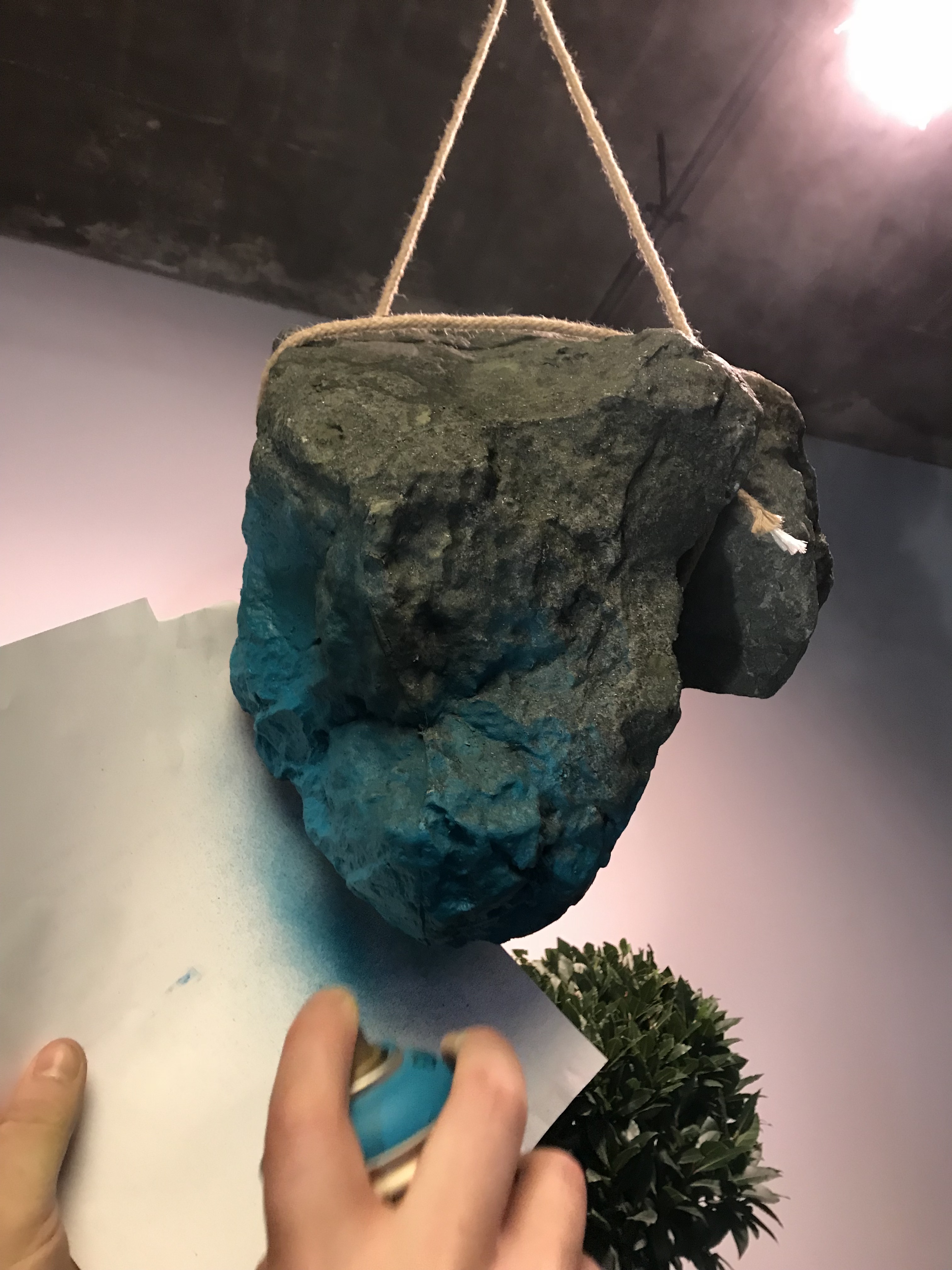

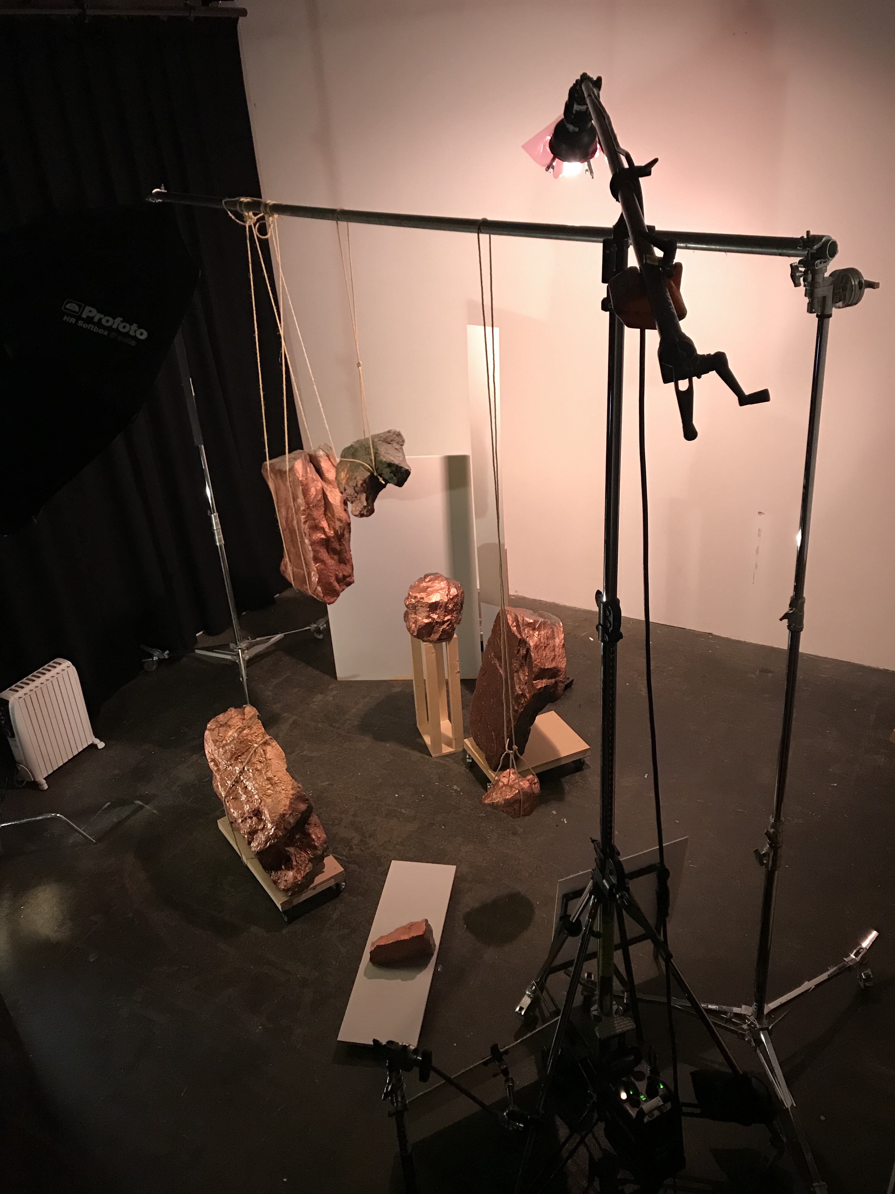

“An outdoor environment that doesn’t play by the normal rules of physics. Rocks become easily transportable objects, and panels function as portals to an alternate reality” — Frame Magazine

Nº 4 of 4: Food.
For the final image, they chose the theme of food. Though it’s ubiquitous, it’s not often an environmental element. The can is revolutionary – its invention changed our relationship to food completely. Its reminiscent of a bitmap, modular, reactive with its simple silver surface which both renders it invisible and responds to the environment around it with reflection and distortion. The shallow water below joins the elements by rising to the right height to make the cans appear to unite, and the projection of Kyoto adds yet another layer of texture and colour.
Shallow water was just below to join elements
“Photography can be a wasteful business, but the contents of all the cans on this issue’s cover were either donated to food banks or turned into amazing corn bread, corn curry and corn fritters. We never want to eat corn again”
— Thomas Brown and Andrew Stellitano
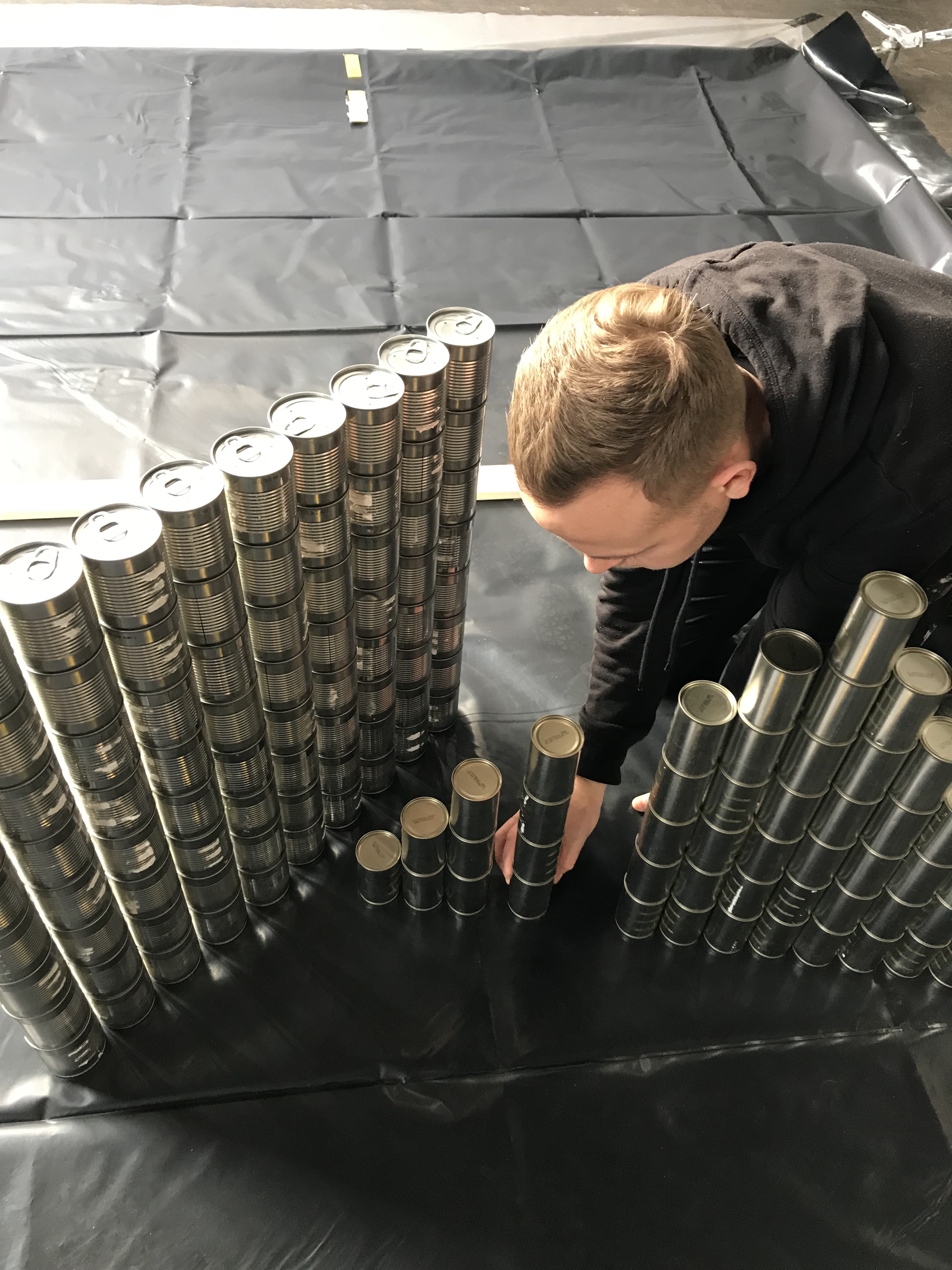
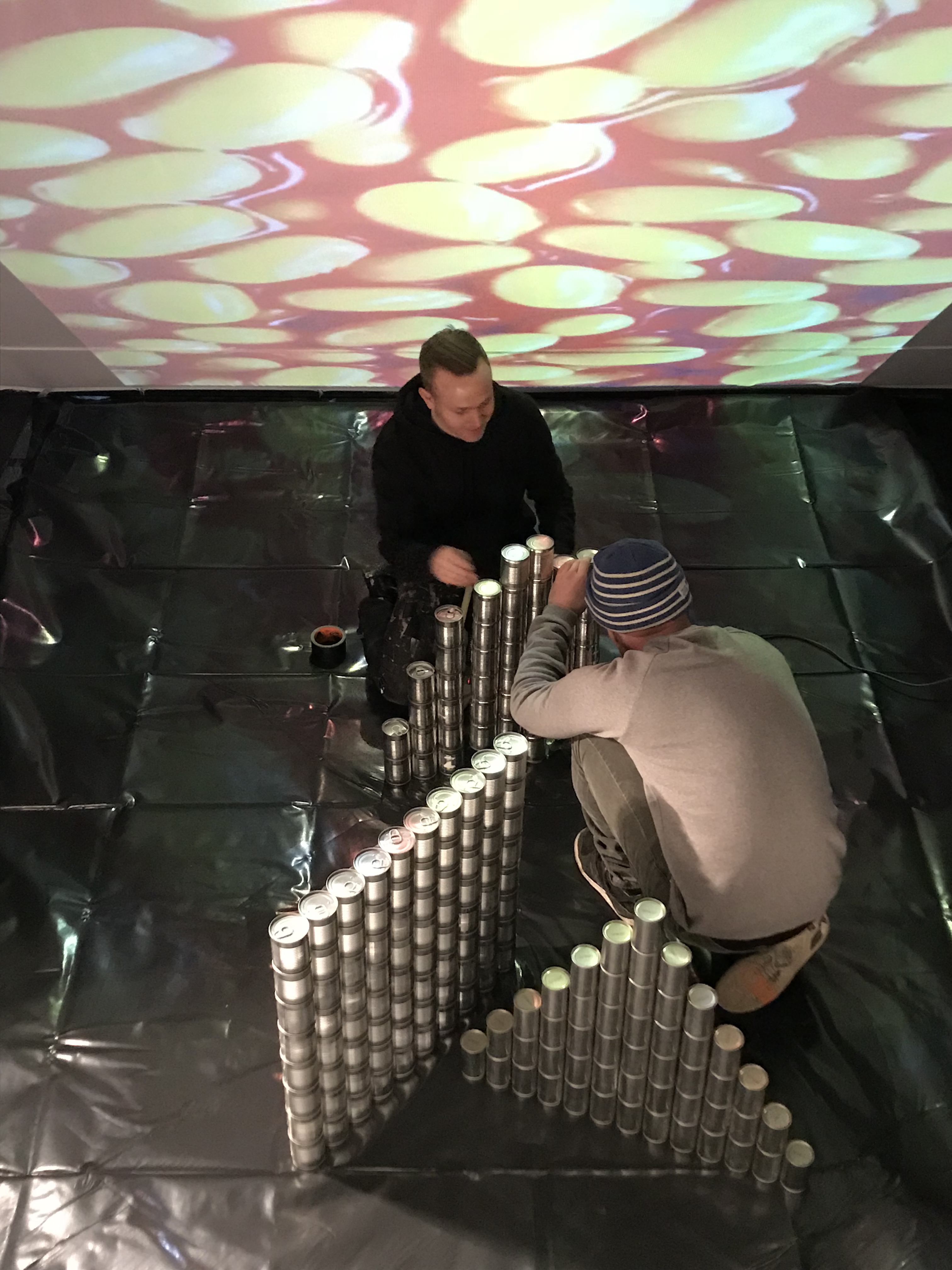
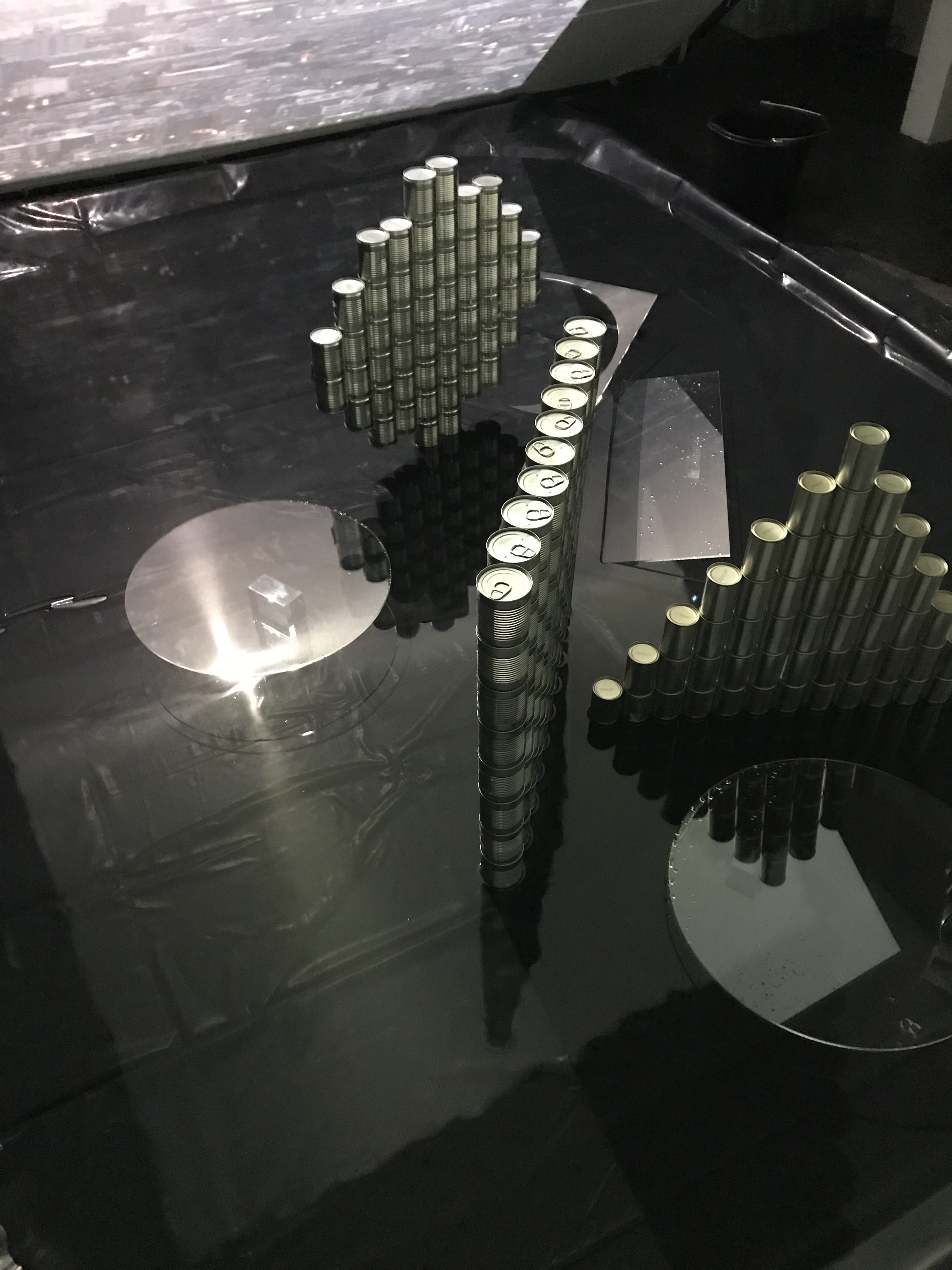

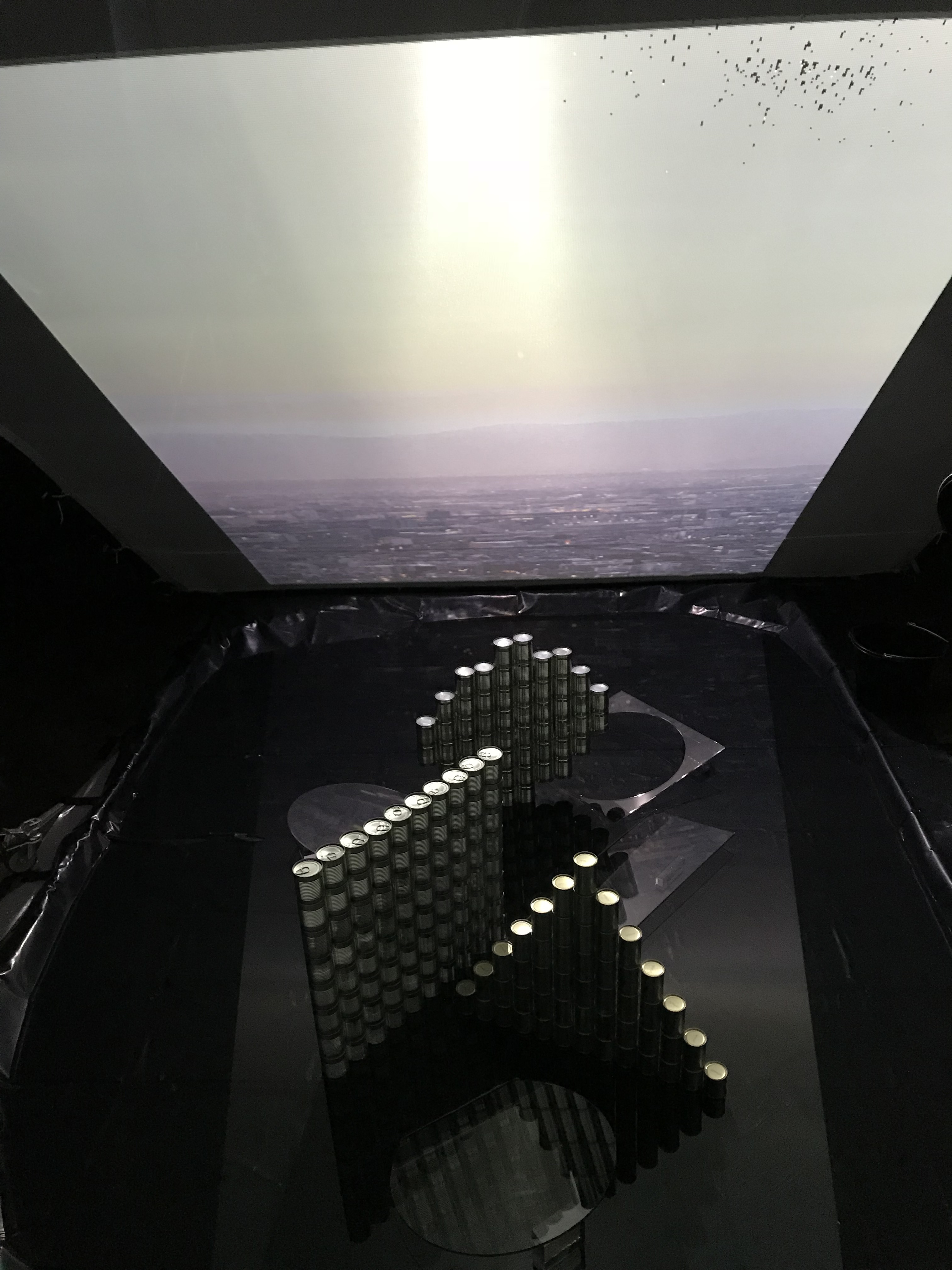

“To round off their series of four covers, designed to explore materiality and space [they] … chose food packaging as their medium. Stacked to form primary shapes, the tins create an intriguing landscape.” — Frame Magazine

Client: Frame Magazine
Photographer: Thomas Brown
Art Direction: Studio&
Set Designer: Stellitano Studio
Post Artist: Aljaz Bezjak / Recom Farmhouse London
Photographer Agent: Webber Represents
You can also see the final images on our website and on Behance.
Recom Farmhouse is on Instagram, Facebook, Vimeo and Twitter!
More work at recomfarmhouse.com.
Fresh work showcased every month in our newsletter – see examples and sign up here. No spam, just the best new images. Unsubscribe at any time.